Challenge
Sportswear branding can get pretty samey.
There’s a lot of noise—aggressive type, predictable symbols, and a tendency to overdo it. The goal here was to create something that feels technical and considered, but still stands apart.
There was also a strategic decision early on. While climbing was the initial focus, leaning too heavily into that—particularly through obvious symbols like ice axes—quickly made the brand feel exclusive.
The challenge became:
How do you design something that feels at home in climbing, but not limited to it?
Approach
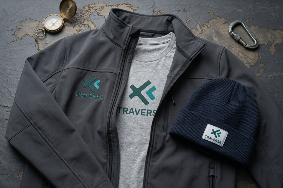
The solution was to step back from sport-specific visuals and focus on something more universal:
- Start with structure, not symbols
- Rather than locking into climbing-specific iconography, the identity is built from a geometric framework. The overall form hints at a cross and directional marker—more like a waypoint on a map than a piece of equipment.
- Build meaning into the letterforms
The mark carries subtle details:
- The “x” extends into a T-like structure
- The arrow form doubles as a lowercase “r”
It’s not shouting for attention, but it gives the logo a bit more depth the longer you spend with it.
Use direction as the core idea
Intersecting arrow elements reinforce movement, navigation, and progression—ideas that apply just as well to trail running as they do to climbing.
Explore colour properly
A range of colour routes were tested before landing on a marine blue-green. It feels technical without being harsh, and avoids the usual high-vis or overly aggressive sportswear palettes.
Make it work in the real world
The identity includes mono and knockout versions so it holds up across different fabrics, finishes, and print methods—whether it’s a subtle chest mark or something more prominent.
Outcome
The final identity feels clean, technical, and flexible.
- A distinctive geometric mark that isn’t tied to a single sport
- A logo system that works across garments and environments
- A colour direction that stands out without trying too hard
- A brand that can move naturally between disciplines—from climbing to endurance sports
In short: a performance brand built around movement itself, not just one way of doing it.