That’s it. Brilliant! Turn off your computer, make a coffee and listen to some jazz because my friend your work is done.
—— Mark G, Rook Vintage
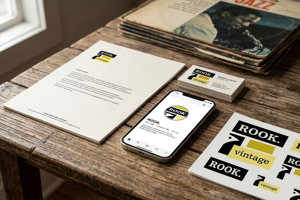
Overview
Rook Vintage is an idea built around two things: vintage clothing and a mix of modernist curios. The brief was to create a brand that could live comfortably in both worlds—something that feels nostalgic without looking stuck in the past.
This needed to work everywhere too. From shop signage and packaging to social profiles and everything in between.
Challenge
The tricky part was getting the balance right. Lean too far into “vintage” and it risks feeling tired or cliché. Push too modern and you lose the character that makes vintage culture what it is.
On top of that, the identity had to be flexible. It needed to look just as good on a tote bag or shop front as it does as a tiny Instagram profile picture.
Approach
Rather than overcomplicating things, start simple, then build:
Start with type
The identity is built around the Kameron typeface. It’s bold, slightly retro, and has just enough personality without getting in the way.
Borrow from jazz
There’s a clear nod to classic Blue Note jazz artwork—simple layouts, strong contrast, and a bit of attitude.
Keep the palette tight - say more with less
A warm, slightly retro yellow paired with black does most of the heavy lifting. It’s punchy, recognisable, and works just about anywhere.
Create a mark that can stand on its own
The rook emblem gives the brand a shortcut. It can be stamped on things, used as an icon, or hold its own when the full logo variations aren’t practical.
Make it work in the real world
Everything was designed with actual use in mind—bags, signage, labels, social avatars—not just nice mockups. We developed multiple variations of the combomark along with knockout and mono. It’s as versatile as you could wish for.
Outcome
The end result is a brand that feels confident without trying too hard.
- It nods to vintage culture without feeling dated
- It’s bold enough to stand out in a retail setting
- It works just as well small (social icons) as it does large (signage)
- And it gives Rook Vintage a clear, recognisable identity from day one
In short: something with a bit of character, that actually works where it needs to.